All 🌄️Curation 📚️Publications 💬️Programs
Total Environments and Design in the Streets: Lessons from MEXICO 68
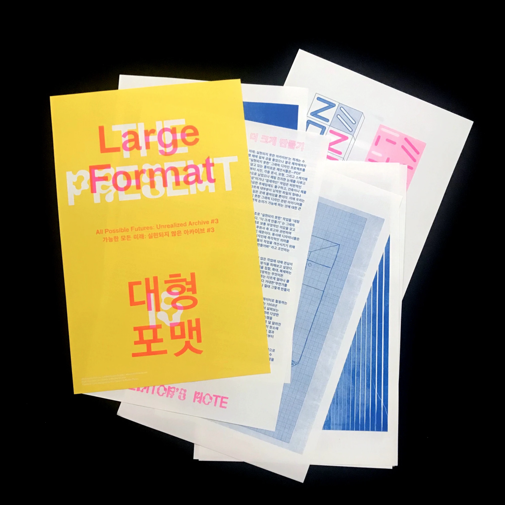
Published in All Possible Futures: Unrealized Archive (3): Large Format, Chris Hamamoto and Jon Sueda, eds. (2019).
The 1968 Milan Triennale ended almost as soon as it began. Known as the “ghost Triennale,” the exhibition’s reflections on the annual theme of “The Greater Number” were seen by few, as sit-ins and protests critical of design’s implication in consumer society engulfed the event’s opening. The occupation took place in tandem with the global protests of May 1968. Ironically, it also resonated with the projects on view within the exhibition, many of which reflected on the city’s transition from architectural artifact to a system of signs, and on the failure of modernism’s dogmas in the face of new social conditions.1
Among the pavilions unseen by visitors was an architectural experiment born from within graphic design. A dense environment of undulating striped walls, the presentation by the organizing committee for the 1968 Olympics in Mexico City placed the viewer inside of the famous logo. A collaborative project by Eduardo Terrazas and Lance Wyman, the pavilion was a metonym for the ambitious design program they and a team of Mexican and foreign designers had articulated for the Games and Mexico City at large. Creating an immersive environment from a graphic sign, the project alluded to the systematic transformations to urban life at the time, including its increasing mediation through data and telecommunications. The events at the Triennale also foreshadowed tensions between design’s urban ambitions and growing social unrest that would manifest in Mexico City, raising questions concerning the limits of design’s ability to effectively (and equitably) structure the city and collective experience.
INTEGRAL DESIGN
The Mexico City Olympic Games centered graphic design and its extension through the urban landscape to an unprecedented degree. The first Olympics hosted in a developing country or in Latin America and the first to be broadcast in color, the embrace of a bold graphic program to coordinate and brand the Mexico City Olympics was a response to both logistical constraints as well as new modes of scripting mass events. While the construction of a new Olympic campus was beyond the budget, the distribution of venues across the city, connected by a system of signs, was in line with increasingly common networked methods for accessing and perceiving information and space.
Pedro Ramírez Vázquez, an architect and president of the organizing committee, described the program as an “integral design system.”2 Emerging under his guidance, it drew on graphic design elements by Wyman as well as a series of proposals for extending the graphics through the city conceived by Terrazas and developed in collaboration with product designer Peter Murdoch, publications director Beatrice Trueblood, and others.
Similar to the Milan installation’s ambition to enclose the viewer within the work of graphic design, the design program sought to rescript Mexico City through a legible series of routes and visual cues. The design team developed pictograms for sporting and cultural events used across print and wayfinding materials; supergraphic pavements that reframed existing stadiums; and maps offering color-coded routes through the city that would be reflected in urban space by coordinated banners, street furniture, and paint applied directly to associated streets. As one contemporary critic noted, this program “went beyond the business of posters, programs, advertisements and other self-contained visual material and impinged on the area of urban logistics,” going on to observe that visitors “can be illiterate in all languages, so long as you are not color blind.”3
COUNTER-DESIGNS
While most of the elements of this design program were realized, Terrazas’s vision of painting the pavement of Olympic routes went unrealized due to budgetary limitations. However, many of the streets he identified for this treatment were eventually transformed in 1968. In August, three hundred thousand students and allied unions marched down Paseo de la Reforma and other major arteries in one of numerous protests that year against the government of President Gustavo Díaz Ordaz, widespread police violence, and the unequal benefits of Mexico’s modernization. The scale of the mobilization dwarfed even the largest of the Olympics’ graphic gestures. The Olympic identity became a visual resource for the protests, appropriated in posters that parodied government officials and the 1968 slogan, “Everything is possible in peace.” While the protests claimed the center of Mexico City, they called attention to its margins—spaces and experiences excluded from the frictionless urban environment envisioned by the organizing committee.
Given its sheer scale, the protest was remarkable for its nonviolence. However, this soon changed. In September, students and faculty were beaten and arrested as the government occupied the Universidad Nacional Autónoma de México in an effort to quell spreading protests. And on October 2, days before the opening of the Games, hundreds were killed in a government-planned massacre during a protest at the Plaza de las Tres Culturas in the city’s Tlatelolco district.
While the student protests ended in violence and repression, they proved the power of social action to reconfigure the terms of the city, often manifesting a power well beyond that of the centralized plan. They also showed how total systems of the sort envisioned by the Olympic committee by definition involved exclusions and processes of official control, an aesthetic regimentation echoed more violently in the actions of the Díaz Ordaz regime. These realizations would only be reinforced days into the Games, as Tommie Smith and John Carlos’s raised fists—an act that led to their immediate expulsion from the Olympics and from Mexico—offered a symbol that would travel much further than the considered image cultivated through the Olympic design program.
DESIGN’S SOCIAL LIMITS
The 1968 Olympics present contradictory prospects for graphic design and its relation to the modern city. The program envisioned by the organizing committee constituted one of the most ambitious visions of design’s ability to move beyond discrete objects to constitute synthetic experiences at urban (and global) scale. However, the immediate collision of these totalizing visions with “external” social movements and practices of counter-design dramatized the rift between the systematic ambitions of design theory in that era and the creative potential of distributed social practice. In this regard, the outcomes of Mexico 68 anticipated current debates at the interface of design and politics, underscoring the tension between the power of centralized infrastructure to work at scale to impose constraints on collective experience while also revealing the potential of localized movements that strategically appropriate these platforms beyond their design intent. Through its contradictions, these official and popular designs for Mexico ’68 diagnosed a new contemporary condition, illustrating that limits to design’s possibilities emerge less through logistical constraint than through its relation to its social surrounds.
NOTES
1. For more on the legacies of the 1968 Milan Triennale see Paola Nicolin, “Beyond the Failure: Notes on the XIVth Triennale,” Log, nos. 13/14 (Fall 2008): 87–100.
2. Quoted in Carolina Rivas, Daoud Sarhandi, and Eduardo Terrazas, “This Is 1968 . . . This Is Mexico,” Eye, Summer 2005, http://www.eyemagazine.com/feature/article/this-is-1968-this-is-mexico.
3. John Canaday, “Designing the 1968 Olympics—the Biggest Fiesta of All,” New York Times, December 31, 1967, A67. For more on the Olympic design program and its connections to urban design and systems thinking in the 1960s see Luis Castañeda, Spectacular Mexico: Design, Propaganda, and the 1968 Olympics(Minneapolis: University of Minnesota Press, 2014); George F. Flaherty, “Responsive Eyes: Urban Logistics and Kinetic Environments for the 1968 Mexico City Olympics,” Journal of the Society of Architectural Historians 73, No. 3 (September 2014): 372–97.